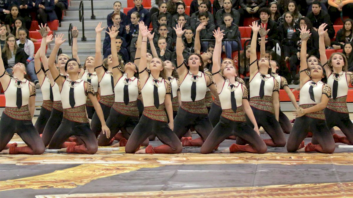
Recap: 2019 WGI Guard Southwest Power Regional Finals
Recap: 2019 WGI Guard Southwest Power Regional Finals
Don't miss a second of the action by following along with our live blog of the WGI Guard Southwest Power Regional finals!
Unlock this article, live events, and more with a subscription!
Already a subscriber? Log In
Don't miss a second of the action by following along with our live blog of the WGI Guard Southwest Power Regional finals!
INDEPENDENT A
Undaunted
Undaunted’s program features what looks almost like an octagonal pool in the back left corner of the floor; from it, a long blue fabric reaches to the opposite corner. The show is based on Samuel Ullman’s iconic quote, “Youth is not a time of life; it is a state of mind…” which opens the production. In particular, Undaunted’s flag work was quite eye-catching. “Forever” is set to Alphaville’s “Forever Young,” so it carries somewhat of an emotional, almost somber tone throughout, which is matched well by the visual design.
Eagle Mountain Independent
Ealge Mountain’s visual design is really captivating; an all-black floor features strokes of gold that form somewhat of a circle in the center. The entire program is set to P!ink’s “You Get My Love,” so it’s very free-flowing with the open, emotional piano chords of the song. Outside of the obvious flags and weapons, Eagle Mountain employs a handful of gold circular props — emulative of rings, perhaps — to add to the overall effect of the show.
Anesidora
This show is pretty tangible from the get-go, with images of gears filling the floor and machine-like props setting up a gate of sorts in the back right corner. Christina Perri’s “Human” sets the stage for a very expressive production. Anesidora uses the different gears on its tarp well to stage performers throughout the floor. An intriguing music-visual conenction, when Perri’s song reaches the climactic lyric, “I’m only human,” each member tosses an individual weapon one after the other, seeming to symbolize the individualism of the lyric. From there on, the work is largely unified, and quite clean.
SCHOLASTIC A
Clements
Clements’ design is pretty minimalistic, with an all-white tarp, black uniforms and one prop, a bench, in the bottom left corner, which makes for a very clean and pleasing overall visual package.
Timberview
Visually speaking, Timberview is a major jump from Clements — not necessarily better or worse, but very different — stained-glass window designs filling the entire floor and the backdrops. As such, this show has a very religious aesthetic to it, and it makes for a beautiful assembly of color from a visual perspective.
Seven Lakes
The floor design for Seven Lakes really catches your eye, despite being void of color; it's all white and gray, with branches and tree limbs shooting into the frame from the outsides. As a result, Seven Lakes' color uniforms and flags really pop during the performance.
Azle
Azle's dominant color is a very light blue, coupled nicely with a bright white that fills most of the floor. A pretty solid amount of time goes by before the majority of Azle's performers pick up any weapons or flags, which makes for a very soft and calm opening but allows for the show's bigger moments to be even more effective.
Pearland
Pearland has a really beautiful tarp; it looks almost like one big conglomerate of sketches, with the outlines of people seeming to fill the floor. With that in mind, it's all black and white with no props; another use of minimalist visual design that allows for the various shades of blue in the performers' uniforms to stand out as the only major influences of color in the show.
Lamar
A streaking comet on an otherwise all-black tarp fills Lamar's floor and makes for a very eye-catching design. All of the performers line up along this comet to start the show, before dispersing throughout the floor as things pick up. Even thereafter, the comet serves as a visual center point to the production.
Bryan
Bryan's got quite the "Tron" look to its design, with a light blue grid filling its floor, which fades from black in the front to bright shade of pink, blue and purple in the back. Those same colors are featured on large circular and curved backdrop props. The uniforms look more like the grid itself — black with light blue trim _ and each member wears a white wig.
Winston Churchill
On an otherwise all-white background, one blue and yellow ballon serves as the focal point of Winston Churchill's floor, while what look like six yellow benches are positioned to the opposite side.
Berkner
A large portion of Berkner's floor is ocvered in what look like framed photos, which makes for a cool collage of memories, of sorts. This "collage" is washed out in a parchment-colored filter, which makes Berkner's purple uniforms really pop nicely on that backdrop.
Keller
Keller's floor is really simple, but somehow still really bold at the same time; bold, not in the "daring" sense, but in the "having a strong appearance" sense. A thick red stripe runs from front right to back left, and at the end of it lies a red and white staircase up to a platform. As you'd expect, this is pretty much the show's centerpiece.
Alvin
Alvin has a clean color scheme that works really well; its floor has a gold-tan look to it, with the darkened shape of wings filling the back right corner, and predominantly light blue flags. One large white structure serves as the show's main prop in the back-left corner. It looks somewhat like a brick wall, and is built up piece by piece throughout the show before being turned around to reveal the front of a biplane.
The Colony
Shades of blue and white, brush-stroked onto a black background, make for a very artistic look in The Colony's production. The overwhelming dominance of blue in all shades really makes for a pretty aesthetic; not only is it prominent on the floor, but it's also pretty prevalent in the costumes and silks as well.
Friendswood
The image of a city skyline silhouetted on a sunset sky makes for one of the prettier floor designs I've seen yet today, and Friendswood's blue and black uniforms compliment it well.
SCHOLASTIC OPEN
Aledo
Set to "I'll Never Love Again" from A Star is Born, Aledo's show is certainly one that tugs at the heartstrings, at it tells the emotional story of love and loss. The color scheme is almost entirely neutrals; black costumes, white chair props, and a floor that look like a hardened, gray grave stone with "R.I.P." on it dark letters. Color is finally introduced into the show in the form of red flags at the final climax of the song, which makes for a nice closing impact.
Ronald Reagan
Ronald Reagan's show dives into the human need for attention, set to a unique arrangement of "I Love You," by Woodkid. The ensemble's floor has a pretty cool design, with shades of purple and green streaking across a black background. This was a very expressive and thought-provoking show, among other good qualities.
Eden Prairie
Eden Prairie definitely has an unorthodox design; its tarp isn't really a full tarp, it's three long, relatively thin lines that stem down, to the right, and diagonally out of the top-left corner, each following a gradient from dark red to gold. The ensemble uses this setup effectively for staging. This show is really free-flowing; there's not a lot of structure of any kind to the music, which definitely makes the show quite engaging.
Dawson
Between its floor and its well-place props, Dawson's design essentially displays a warped, spiraling clock, which works well with the them of "Timeless." This show is largely set to string music, which creates a very expressive feeling. The performers match that feeling well in terms of their individual characterization of the them.
Eastlake
Eastlake has a really cool look to its design, with no tarp, but several paintings positioned around the outer edges of the floor. The entire ensemble starts the show inside a bright yellow box, before emerging to perform a high-energy production, set to hard rock music. While a majority of the day's performances — not that this is a bad thing — went for the emotional side in terms of theme, Eastlake stood out, as its show is engaging in a much more high-octane sense.
Klein Oak
The design for Klein Oak is really bare-bones, but it works so well. The only things on the floor are long pieces of wood that form a square in the center of the floor, and one vertical one that stands in the bottom left corner of the floor. These two-by-fours are separated as the show moves on and ultimately come together to build the image of a house — the show is set to Joy Williams' "Welcome Home," so this image really ties a nice bow on the concept.
Tompkins
This show had some really beautiful visual designs; it's a very nature-scene look to the floor, with green leafy images filling the majority of the tarp and a water-like shade of blue near the bottom. Four ramps, designed to look just like the floor itself, also emerge from the floor and are used — quite well, I might add — throughout the production. The musician in me really enjoyed this one, too, because it featured a beautifully arranged string medley of several well-known classical pieces.
Leander
This was a really unique take on a common marching arts show concept, that of "home." The word was written in all caps across Leanders' floor, but embedded in white within a collage of photos of everyday individuals, which really hammered home, visually, the idea that everyone has their own take on what home means. The show being set to "Home" from Pose only augmented that concept even further, and made for a really powerful ending once the final chorus kicked in.
Little Elm
Little Elm's show had a really cool of use of color, with blue and purple dominating most of the floor but orange sticking out in the back-right corner with a platform in the same color positioned in that area. I was really wowed by the cleanliness of Little Elm's flag work, especially in some of the bigger moments where the full ensemble is performing together. This show had one of the wider ranges in expression, and I was impressed with how the members sold it.
McNeil
An old, seemingly rusty, metal swing — the kind you'd see on an abandoned playground — is the focal point of McNeil's tarp. The lone prop is what looks to be a front door, positioned on the opposite side of the floor. Set to "Clair de Lune" by Debussy with the lyrics of reminiscent song lyrics overlaid, the show has a very nostalgic feel to it. The members do a really good job of characterizing the emotions that go with such a theme.
Dripping Springs
Dripping Springs has a really intricate and produced visual design. In the back left corner, fenced into a round area, is a small spaceship that rotates around an axis like you'd see at Disney World or something like that. So, this show embodies kind of a childlike view of an amusement park, set to Angie Aparo's "Wonderland."
INDEPENDENT OPEN
Redemption Guard
Ironically titled, "A Path to Redemption," Redemption Guard's show is really well-staged. It's pretty minimalist, which I personally like a lot; there are a few light blue streaks of tarp, which appear to be the "paths" in question. One of those streaks is a raised ramp, which serves as a focal point for a lot of Redemption's movements.
Spirit Independent from The University of Houston
Set to "Clouds" by Before You Exit, Spirit Independent's show is really pleasing to the eye and beautifully designed. With an emphasis in soft, light shades of blue, gray and white, the colors portrayed really match the somber nature of the music, as does to the emotional performance by the members.
Black Gold Open
This group has a really cool design; its floor shows a blue burst of light extending from a circular platform in the center of its floor. Dressed in all black, the performers almost look like silhouettes on the bright blue from a distance. Black Gold Open has a pretty up-tempo piece of music, and the work follows suit, which makes this show an engaging one to follow.
ORIGINS
ORIGINS' floor is artistically littered with references to the Bible passage, Psalm 23, from which the show's title, "Though I Walk," is derived. Phrases from this passage are ethereally whispered and echoed at the show's outset, before the music comes in. This show has a really wide range of music styles and emotions, and the performers do a fantastic job with those shifts in mood.
SCHOLASTIC WORLD
Marcus
Marcus’ floor features large “Walk of Fame” stars and what looks like a red carpet running along the front side, making the theme for “Stars” — an otherwise vague, interpretable term — pretty tangible from the start. The show’s opening is set to Nina Simone’s song of the same name, which makes for a rather somber take on the concept of being a star, as the song’s lyrics touch on fame’s fleeting nature. The color scheme matches this feeling; the entire floor is a washed out gray — even the Walk-of-Fame stars — and Marcus’ uniform features similarly dull shades of white and gray. The first real introduction of color comes at the song’s rousing climax, when the full ensemble picks up red flags; this makes for a really powerful finish to an emotional show.
The Woodlands
This show’s color scheme is quite beautifully presented throughout the visual design; the dominant color of white covers most of the floor, but accents of teal and gold fill the trim and the uniforms. Six round platforms, each with a wooden stool positioned on it, are distributed throughout the floor. This show has very expressive music, most heavily featuring piano and high strings. Things go darker in the show’s middle movement, which features nearly the entire ensemble performing with translucent white flags as opposed to the bright teal used in the first movement. To close, the music picks up and brightens once again, as does the movement of the members/ All in all, this show could best be described as beautiful, in terms of color, music selection, and the work that is coupled with said music.
James Bowie
This show has no lack of color, as shades of blue, purple, green and orange dominate the visual design. The entire ensemble emerges from a large, inflated prop in the back right corner, as narrations about Darwin’s Natural Selection theory, set to flowing piano music, fill the speakers. The title refers to a term that describes the compounds from which scientists hypothesize life originated. With that in mind, it’s a very abstract production presented by James Bowie, which ends up transitioning into a bit of a tribal feel near the show’s mid-point. The whole way throughout, though, there’s no shaking the overall ethereal nature of the show, created in large part by the free-flowing piano music and incessantly repetitive narrations.
INDEPENDENT WORLD
Lake Area Independent — "Rebirth of Daniel"
This show has a very African tribal feel from the very beginning, and is centered around one individual, presumably the “Daniel” character based on the show’s title. The dominant color in this show is blue; various shades of it are seen on the floor and the uniform parts. After a rather dark and mysterious opening, brighter music kicks in, and the aforementioned main character is seen dancing freely throughout the floor, as the rest of the members perform around him. The show’s climax is a string-heavy flag feature moment, in which lime green flags fill the otherwise all-blue stage.
Invictus — "The Path of Totality"
At the center of Invictus’ otherwise dark floor looks to be an eclipse of some sort, in which a darkened object the majority of a bright star behind it. Members lay around the outside of this image to start the show. The show’s title refers to the geographic range in which people can get the perfect angle to see a total eclipse. Invictus’ show is a very ethereal one, and the performance that goes with it is very expressive, and performed at a very high level.The members end the show exactly how they started it, positioned around the outside of the eclipse in the middle of the floor.
Cypress Independent — "On Foggy Streets"
Cypress has a really unique overall design to its performing surface, with a couple of large areas of its tarp covered in a light brown brick design and street lights and other objects strewn about the floor. This show has a really big and bold opening that really catches your attention, and from there it's very mysterious and up-tempo. The music drives, and the work fits that tone well. There's kind of an artistic lack of unity in the visual design, which makes it almost feel more like a real-life street scene.
Black Gold — "The One You Can't Forget"
Black and gold, ironically, are the dominant colors — they’re really the only colors — in the ensemble’s floor and uniform designs; a gold table is positioned at the middle of the floor, with two chairs, and serves as the focal point for a sizable portion of the performance. Set to Damien Rice’s “The Greatest Bastard,” this show certainly tugs at the heart strings. The show is entirely set to Rice’s acoustic ballad, which has a very somber, soft feel and lyrics that harken back to a person whose memory the singer simply can’t let go of. That combination, plus a beautiful execution of the show by the members, makes for quite the memorable, emotional performance. The show’s climactic flag feature is already impressively clean, and fits well with the song’s final chorus.
CGT Denton —"Wanted"
CGT Denton’s visual design as a very “Wild West” feel to it; its very, very large tarp features the kind of hardwood design you’d see in a Saloon, with the watermark of a longhorn skull positioned in the middle. Wooden tables and counters are positioned at various spots throughout the floor, and an ornate wooden gate is centered along the back side, setting the full scene for an entertaining production. A full ensemble dance feature, set to the simple sound of whistling, serves for an impressive and attention-grabbing opening. From there, Asaf Avidan’s “Bang Bang” sets the tone of a deep country feel.
CGT Dallas — "Unsub"
CGT Dallas’ floor is nothing if not eye-catching, with streaks of red coming from one side and a burst of blue coming from another. Its title, “Unsub,” refers to an unknown suspect — as in, a criminal on the run. In a way, it’s a different take on the same concept, “Wanted,” that CGT Denton performs, set to a unique acoustic arrangement of Elton John’s “Have Mercy on the Criminal.” Where as CGT Denton featured Saloon tables and the like, CGT Dallas’ design is fully equipped with a getaway car, scaffolding, wanted posters — the whole nine. No matter how you slice it, though, it’s quite impressive and has quite the production value, as you’d expect from a group that finished mere tenths out of a World Class medal last season.
Related Content
 WGI World Championship 2024: Guard, Winds And Percussion Champions
Apr 22, 2024
 WGI Scores 2024: WGI World Championship Percussion, Winds Results
Apr 21, 2024
 Replay: UD Arena (Multicam) - 2024 WGI Percussion/Winds World Championships | Apr 21 @ 9 AM
Apr 21, 2024
 Replay: UD Arena (Highcam) - 2024 WGI Percussion/Winds World Championships | Apr 21 @ 9 AM
Apr 21, 2024
 Replay: UD Arena (Multicam) - 2024 WGI Percussion/Winds World Championships | Apr 20 @ 9 AM
Apr 21, 2024
 Replay: UD Arena (Highcam) - 2024 WGI Percussion/Winds World Championships | Apr 20 @ 9 AM
Apr 21, 2024
 Replay: Truist Arena - 2024 WGI Percussion/Winds World Championships | Apr 20 @ 9 AM
Apr 20, 2024
 Replay: UD Arena (Highcam) - 2024 WGI Percussion/Winds World Championships | Apr 19 @ 9 AM
Apr 20, 2024
 Replay: UD Arena (Multicam) - 2024 WGI Percussion/Winds World Championships | Apr 19 @ 5 PM
Apr 20, 2024